On immersiveness
Immersive storytelling has become something of a mantra for publishers and others exploring the possibilities of enhanced ebooks. But what is it that makes books immersive, and how can that quality be preserved or even enhanced on an electronic device?
We all know what immersive reading feels like. It’s what happens when you look up from the page and realise the weather has changed outside, or you’ve gone three stops too far on the train, missed a meal, or stayed up so late it’s hardly worth going to bed. It’s that feeling of being taken fully inside the world of the story and held there, utterly absorbed. That’s the feeling that has to be bottled if enahnced ebooks and the devices they run on are ever to be truly embraced as a part of mainstream reading.
Separating fact from fiction
When ebook skeptics talk about the feel of a book in their hands, or the smell of the pages, I doubt they have a car manual1 or a physics textbook in mind. There’s an easy case to be made for enhanced, electronic versions of purely functional, extractive reference material. It doesn’t take up shelf space, and a short video demonstration is going to make changing the spark plugs on your cherished VW Camper a much more strightforward task. We look to these books for a particular piece of information, and generally count them successful if they give us what we’re looking for in as short a time as possible. In print, they are already enhanced with diagrams anyway – motion graphics and an audio commentary are a natural extension of this utility.2
Narrative is a different matter.
We don’t dive into a novel looking for the answer to a particular question, unless the question is “what happens next.”3 The same goes for narrative non-fiction. Our interest in a biography, history or popular science book may be piquied by the desire to learn something, but it’s the narrative engagement that provides the pleasure and the impetus to keep reading if we don’t absolutely have to. That’s the experience that, by association, creates the emotional and physical attachment to the book as a physical object.
Focus on the story
So what makes a novel immersive? there are three factors that I think contribute to immersiveness.
- The quality of the storytelling
- The ability of the reader to focus attention on the story
- The extent to which the reader can respond imaginatively to the story
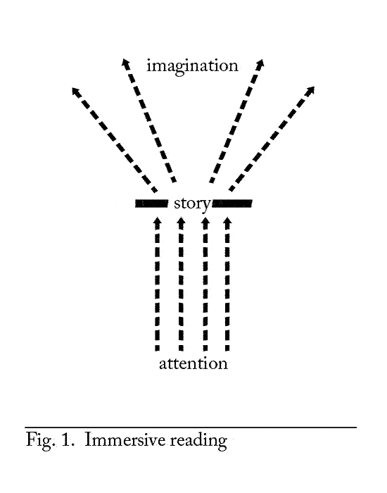
The first is clearly the most important, and is itself a combination of many factors. But this is what writers and publishers focus on already, so let’s take it as read and concentrate on the other two. In short, we want to be able to focus on the story without distraction, and to have our imaginative response range freely. Here’s a diagram to show what I mean.
 Yes, I know. It’s horribly reductive to present the sublime experience of reading in a format that belongs in a physics text book. But bear with me.
At the most basic level, the situation depicted above requires nothing more than the text, well presented on a device that’s comfortable to hold and to read, and which doesn’t intrude on the reading experience. For my money, the mass market paperback is a pretty high benchmark here. Even if the physical ergonomics can be taken care of by device manufacturers, publishers still need to deliver text in a way that will display both clearly and accurately. Every OCR error, every typographic anomaly, is an irritation and a barrier that breaks the immersive spell between reader and story.
Driven to distraction
Throw into the mix multimedia enhancements, hyperlinks, social networking opportunities and the like, and the number of potential distractions grows exponentially. Multifunctional devices put all these distractions within easy tapping distance, but that’s no reason to bring them right onto the page alongside the text. We already have media like that; they are called websites, and while they are wonderful for all kinds of things, immersive narrative is not one of them. The web is immersive in its own way, as anyone knows who has spent an entire afternoon playing follow the link, only to end up with scores of tabs open in their browser, mounting stress levels and only a faint recollection of what it was they were looking for in the first place.
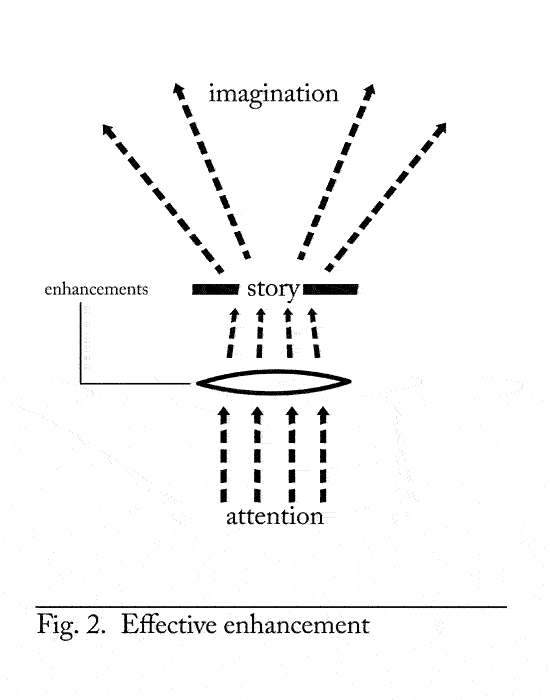
In the lower part of our diagram, at the very least we want the additional features to keep out of the way and not distract us from the text. Anything that is not a part of telling the story should reside far enough below the surface of the book to be unobtrusive, yet close enough to be summoned quickly and intuitively when required.
Some features can be used to assist our concentration. Subtly integrated notes for example would allow the reader to call up additional information when needed and dismiss it, without leaving the page. This would be less of a distraction than pbook endnotes, which require flipping back and forth between pages. Synchronising text to audiobook is a brilliantly simple, powerful feature of some Enhanced Editions iPhone appbooks. It improves immersiveness by overcoming an obstacle commuters face every day: namely, having to read in short bursts. Now, you can read from the screen while sat on the tube, and switch to audio to continue the book seamlessly while changing trains or walking the rest of the way to your destination. You can tell they’ve really thought about the device, how it is used, and how to put its capabilities to use in service of the story and the reader.
Returning to the diagram, features like these act as a lens, focusing the readers attention even more on the story.
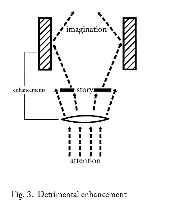
 In the upper portion of the diagram, what we want to avoid is anything that trammels our imaginative response to the text. Take an embedded video clip, for example. One notion I’ve seen mentioned would be to package Sense and Sensibility with snippets from the film version. This strikes me as a terrible idea. Not only would it be likely to fail the first test and distract attention away from the text, it also fails the second, by imposing Colin Firth’s interpretation of Mr Darcy onto the reader’s imagination. All without any of the compensations of a full film viewing experience.
The worst case scenario is a reading experience cluttered with visual distractions that disperse rather than focus the attention, coupled with content which confines the imaginative response to the text. One of the strengths of the iPad is that the software has been designed from the ground up for the touch screen interface, with the aim of providing a capable, intuitive and fun user experience. Software designed for keyboard and mouse just doesn’t play nicely when you’re trying to interact with your fingers on a screen. Instead of bringing you closer to whatever you’re working with, it adds an extra layer of frustration. Ultimately, I think we’ll see a similar development with books, with content conceived with tablets in mind as their primary or even only delivery mechanism. These will find ways of integrating different media in a much more intuitive and seamless way. Immersive transmedia stories are a real possibility, and an exciting one at that. I just wonder to what extent they can be successfully created around long-form prose primarily intended to be read from start to finish.
- Though there are some lovely examples [↩]
- This 2004 paper by Alex Humphreys is an interesting analysis of the different properties of immersive and extractive books, and the implications for ebooks. [↩]
- Unless we’re students of course. I spent three years of an English degree reading great works of literature through the filter of essay questions and it took me a long time to recover the ability to read immersively, purely for pleasure. [↩]


Leave a Reply